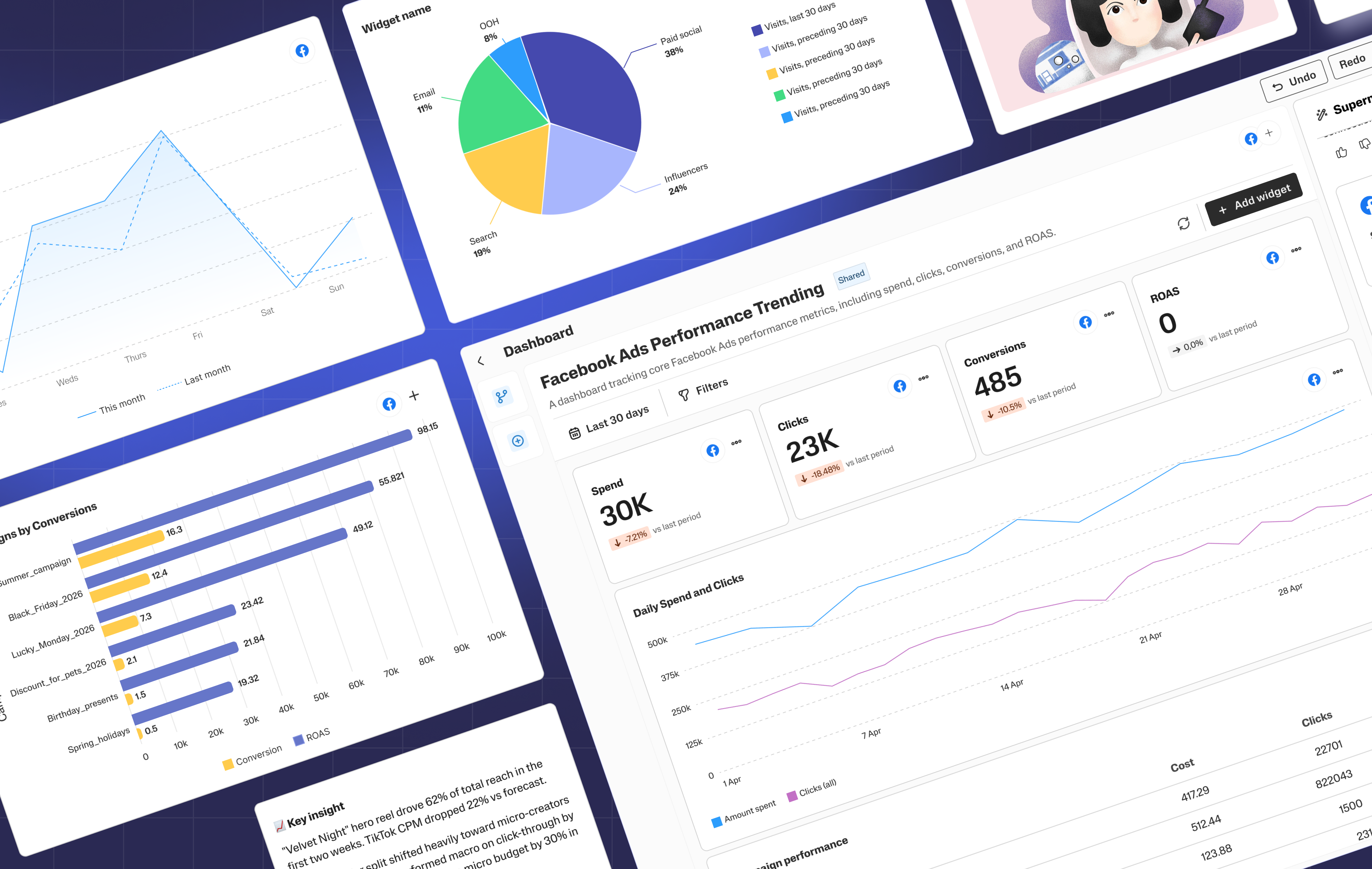
Supermetrics Dashboard
- Role
- Lead Designer
- Industry
- Martech
- Scope
- Research
Product Design - Company
- Supermetrics
- Duration
- 1+ year
Starting from understanding users’ need to the design process and delivery.
Facts about the project
Six months post-launch, the Dashboard has had no dedicated promotion, growth has been entirely organic while the team continued building. Despite that:
Adoption rate
8.5%
Teams
2,556
Individual users
~10,998
Monthly user growth
+93%
Dashboard created
5100+
Strategic framing
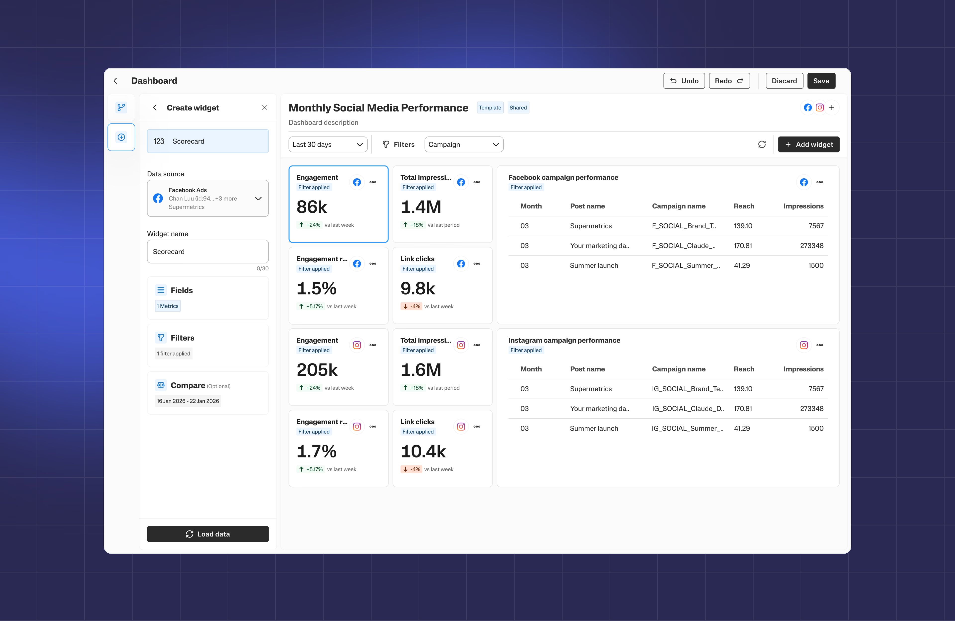
We wanted to provide SMB marketing professionals with quick and easy access to key insights from their marketing data in our Supermetrics Hub.
Key benefits:
- Quicker time-to-insight: from connecting your data source to seeing your data
- Fast wow-effect when onboarding: the power of Supermetrics displayed instantly
- Data validation: validation that our solution works, you get the data you need
Research and discovery
We interviewed marketers to understand how they work with data. They primarily use tools like Looker Studio, HubSpot, and Google Sheets, but found them overly complex for everyday use.
Insights
Key pain points:
- Complex setup
- Manual data handling
- Steep learning curve
Problem
Business users need insights—not data work.
There’s a clear gap between technical tools and everyday usability.
Product direction
Templates (Quick Start)
Instant dashboards—connect data, get insights.
Custom Builder (Advanced)
Flexible setup for deeper, tailored needs—kept separate to reduce complexity.
Design process
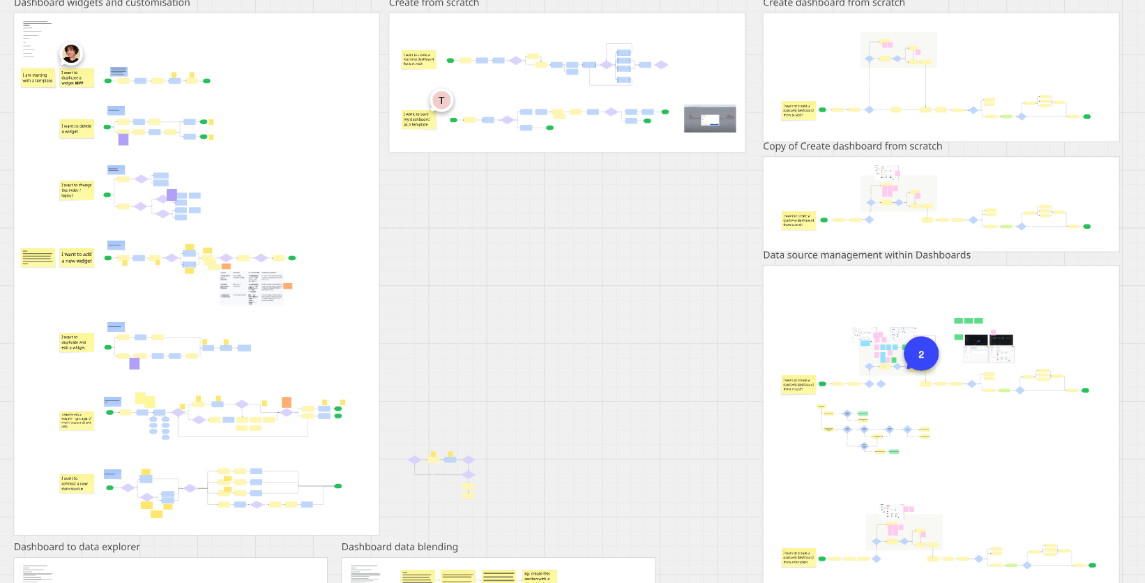
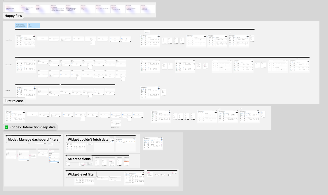
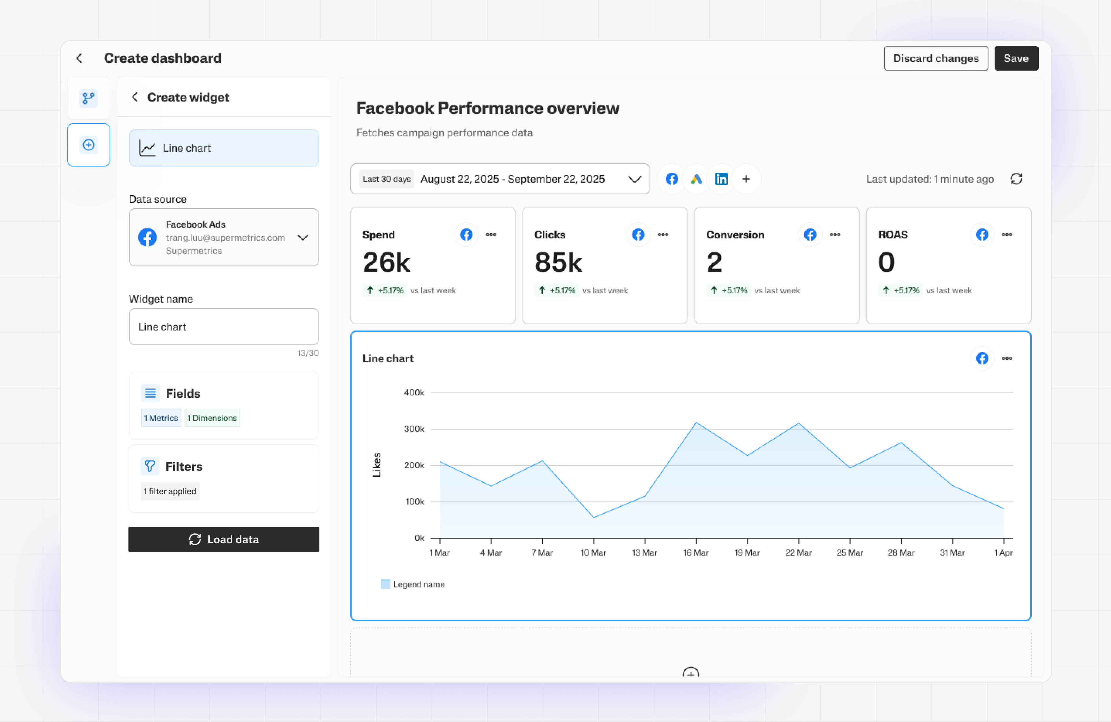
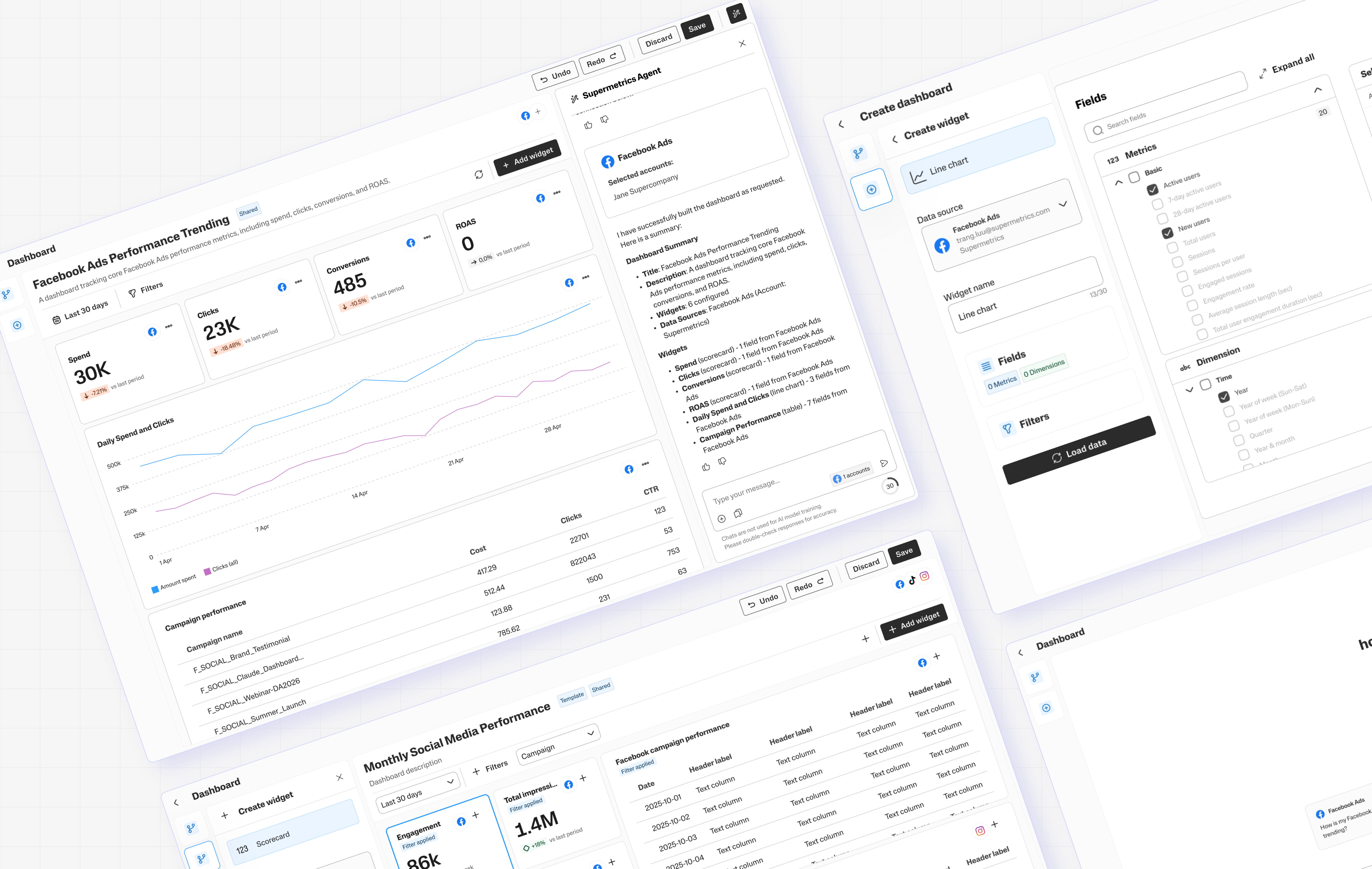
Work begins in low fidelity, defining logic and interaction before any visual decisions are made. From there, it moves through multiple drafts: narrowed by technical feasibility, shaped by engineer and product input, and tested against real users before anything is locked.
Based on our understanding of the industry standard + knowledge from our own internal marketing team we make decisions on what are the P0, P1, P2
Improvements
The initial release was intentionally scoped: core widgets, basic layout. We tested it with our internal marketing team before any wider rollout — which surfaced a clear picture of what the MVP was missing.
Some gaps we already knew about but had cut for time. Others only became visible when real people ran real reporting workflows through it:
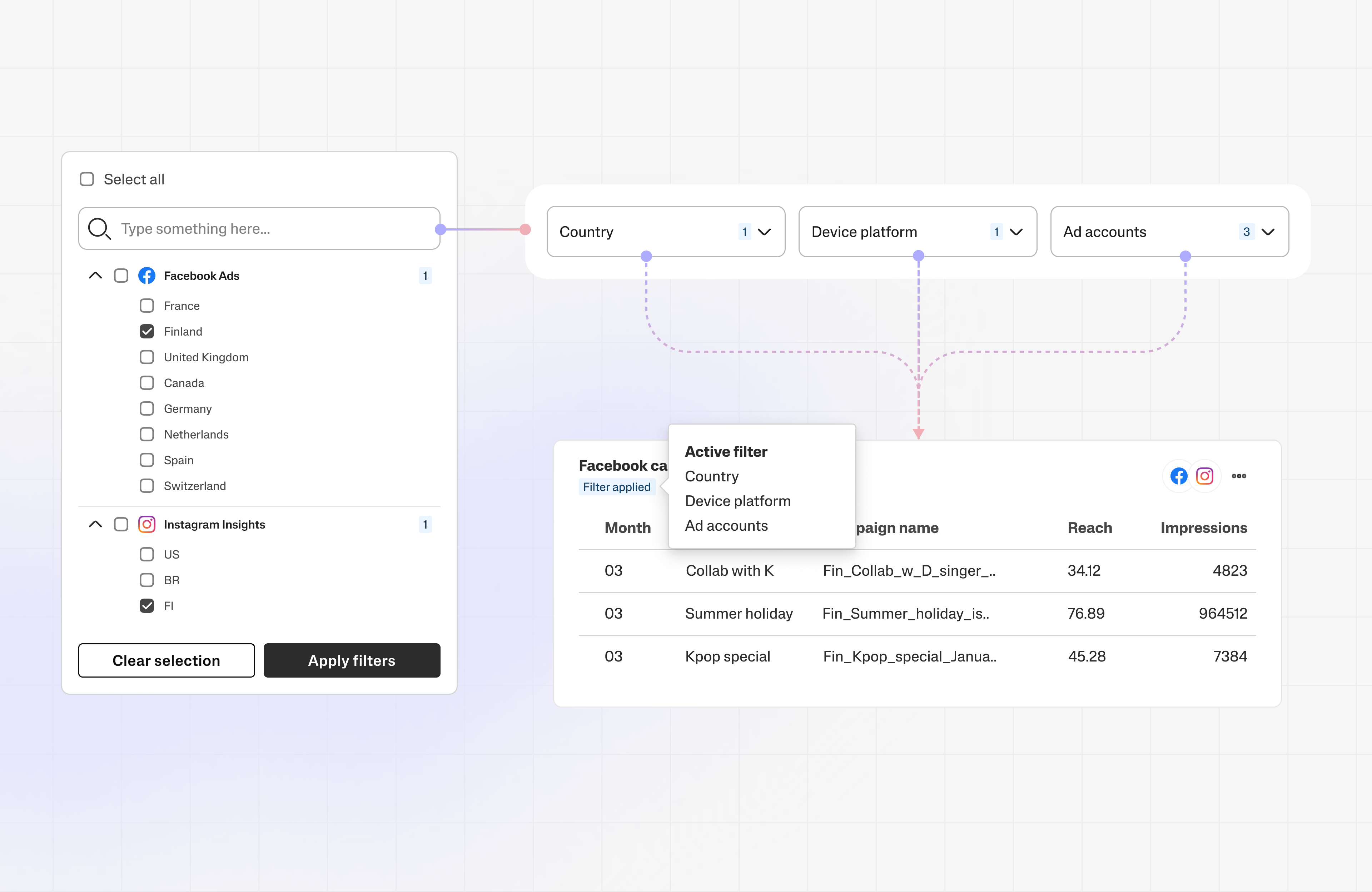
- Dashboard level filter
- Additional widget types
- White labelling
- etc
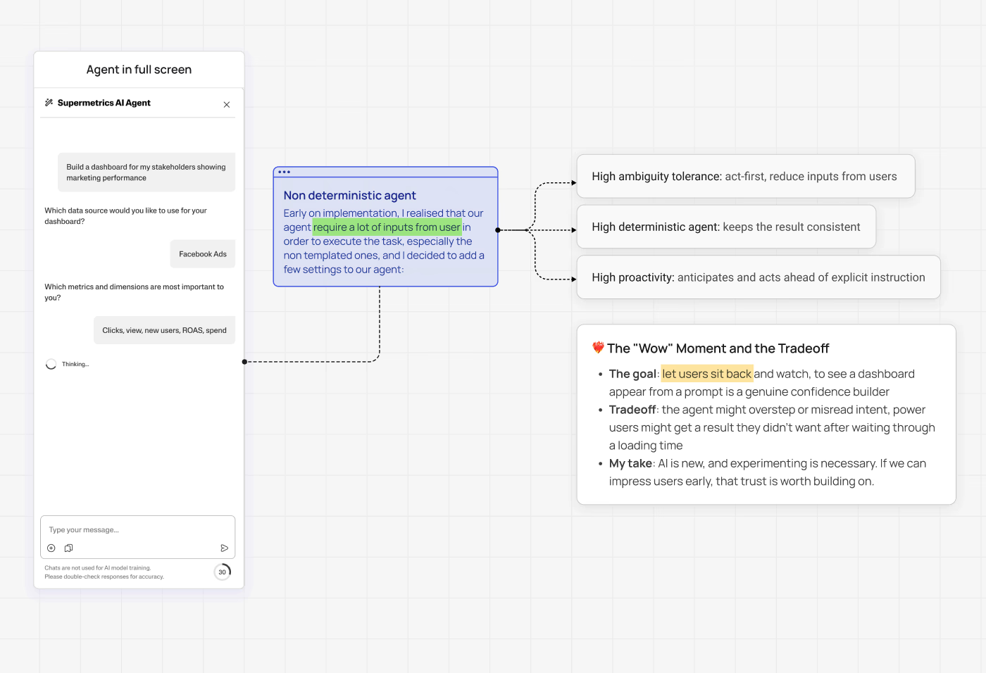
Many of the problems and missing features are known issues and we need to start prioritizing based on the availability of our technical capability in order to plan and ship each feature out. Alongside working with our Agentic Agent product, we also plan and design other features.
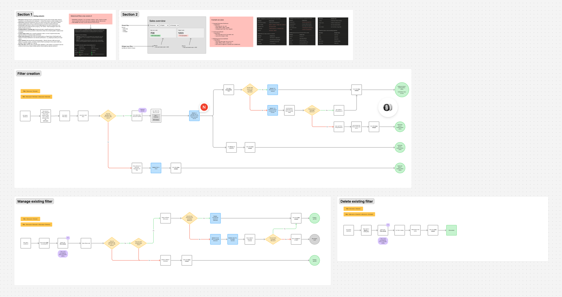
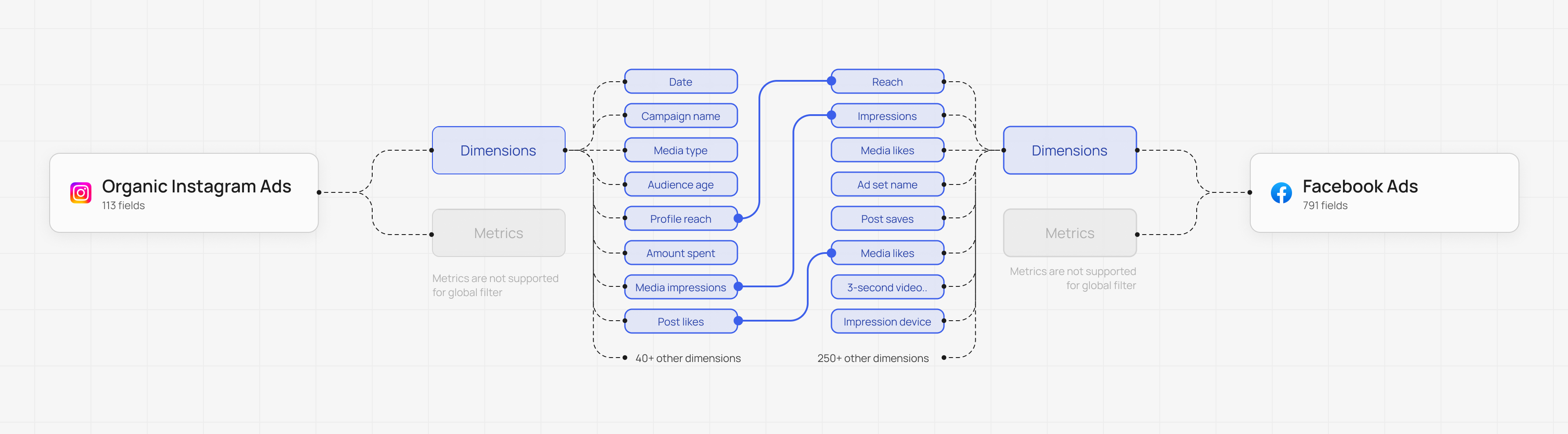
One of the many additional features we added to our dashboard was dashboard level filter. This is one of the most requested and also complex in term of delivery due to its complexity with multiple data sources handling.
Outcome
Six months post-launch, the Dashboard has had no dedicated promotion — growth has been entirely organic while the team continued building.
Despite that, tens of thousands of individual users have tried it, with thousands of teams and hundreds of customers actively using it today. Monthly user growth is running at nearly double each month, and thousands of dashboards have already been created.