Hartwall / Royal Unibrews app
- Role
- UX Designer
- Industry
- Beverage, ecommerce
- Scope
- User Research
UX Design - Company
- Hartwall
Royal Unibrew - Duration
- 4 months
Leading the design for the e-commerce mobile app of Royal Unibrew and Hartwall through UI/UX design and usability testing.

Context
Royal Unibrew owns Hartwall, and the two run as distinct brands. Their current e-commerce website doesn’t work well for bar and shop owners, so they wanted something natively built, functional over nice UI, and able to fit both brands from one foundation (Royal Unibrew for Denmark, Hartwall for Finland). It also had to ease the load on sales reps, who struggle to travel to accounts spread across rural Finland and Denmark just to take orders.
Research first
Before wireframing, I ran user interviews in Finland and Denmark with each country 5 to 6 actual shop and bar owners. This is where the real problem got defined. Almost everything that shaped the product came from these conversations, not the brief.

What else the interviews uncovered
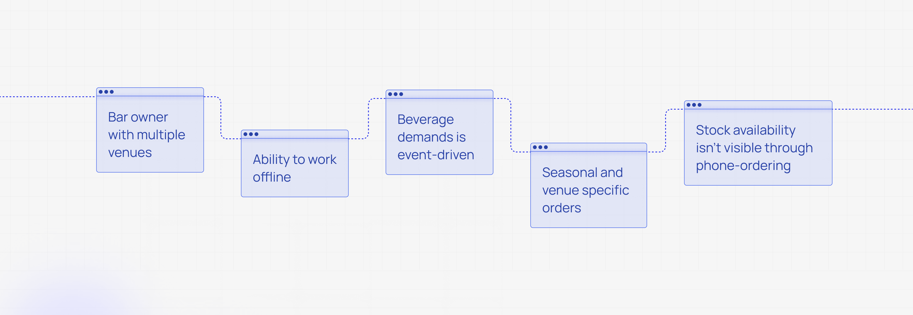
- Many owners run several venues, so ordering couldn’t assume one account equals one location.
- Connectivity can’t be assumed. Storage areas are often out of signal, so the app had to work offline, letting users build and number an order with no connection and sync later. A hard requirement.
- Demand is event-driven. A nearby event next week means stocking up now, pointing to both proactive notifications when an event is happening close by and a forecast function so owners aren’t caught short.
- Ordering is seasonal and venue-specific, so owners wanted multiple wishlists for different seasons and different bars.
- Ordering happens by phone today, so owners often don’t know if an item is in stock until someone calls back or the delivery arrives. Real-time stock visibility became a must.
Design response
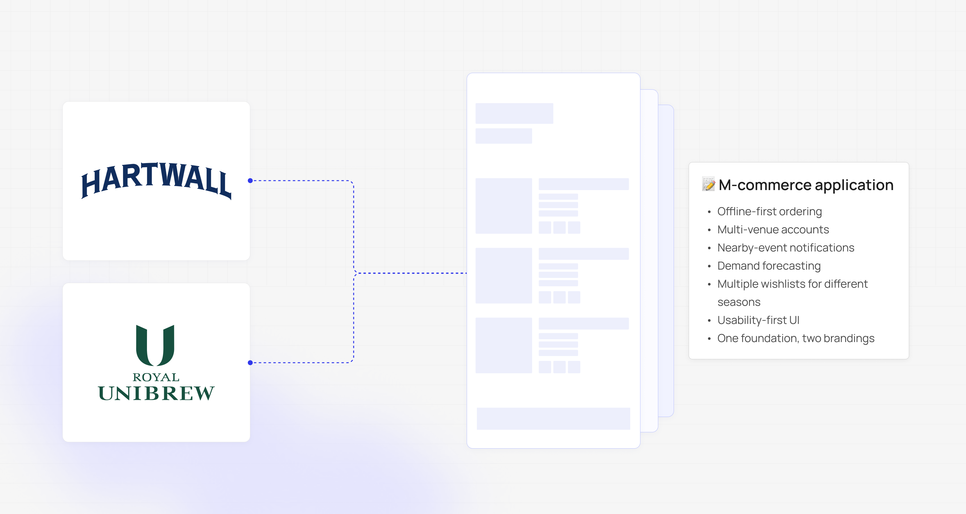
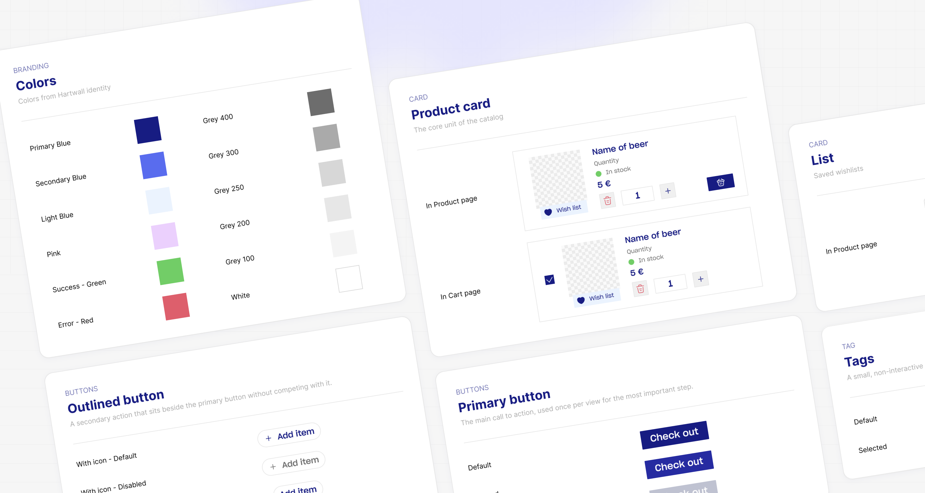
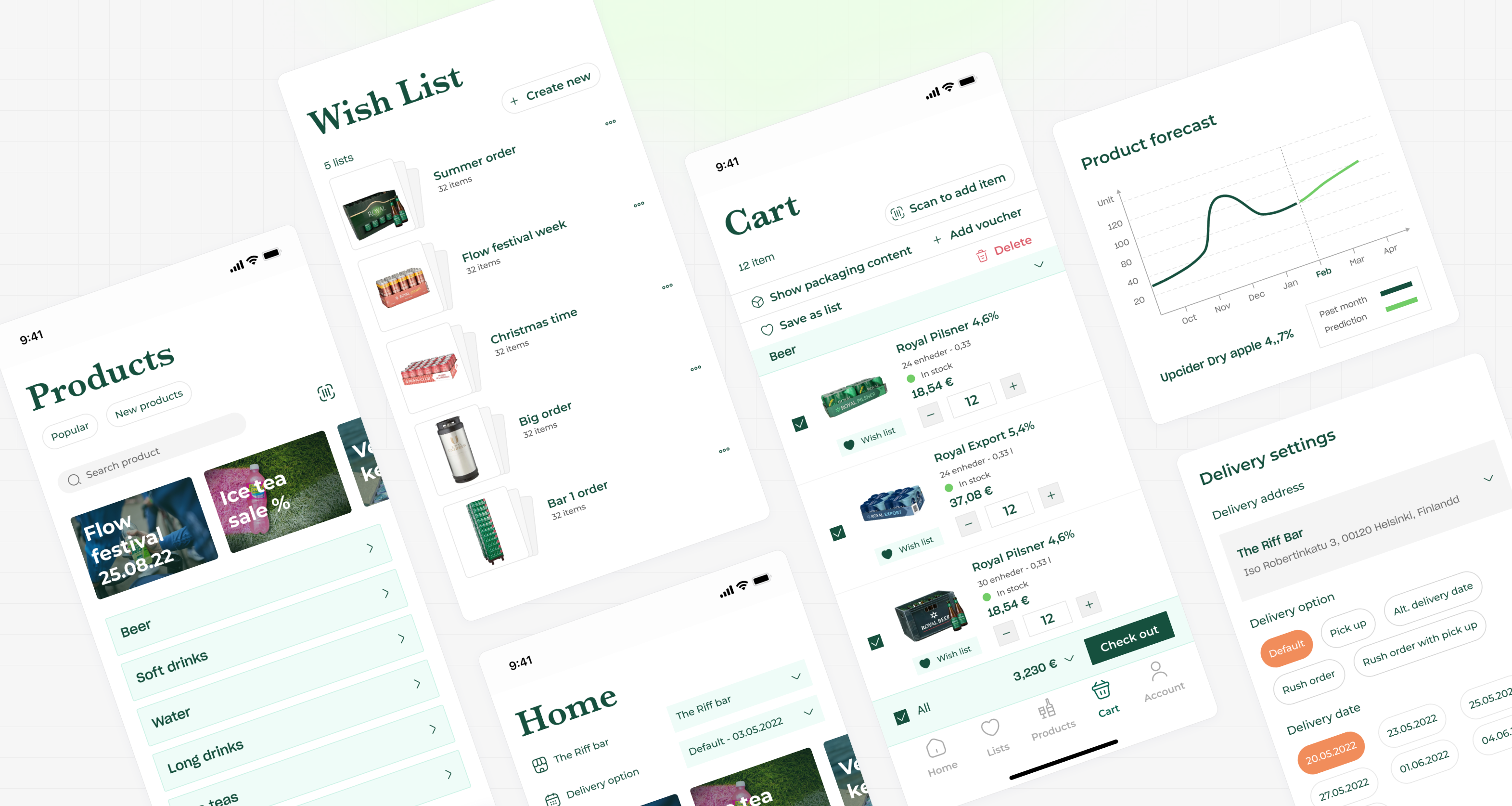
Each finding became a feature: real-time stock visibility, multi-venue accounts, offline-first ordering, nearby-event notifications, demand forecasting, multiple wishlists, and a shared design system skinned as both brands. The “keep it functional” direction shaped the system itself: legibility, obvious tap targets, and speed, with styling always in service of usability.
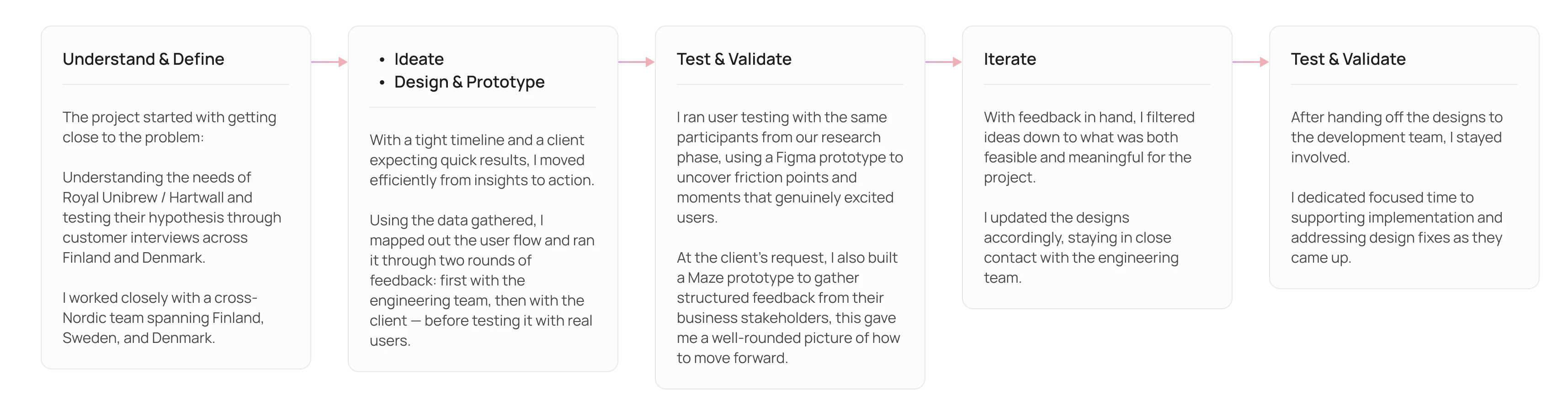
Each feature was prototyped, tested with users, validated, and refined before being handed off to implementation.


Two identities, one system
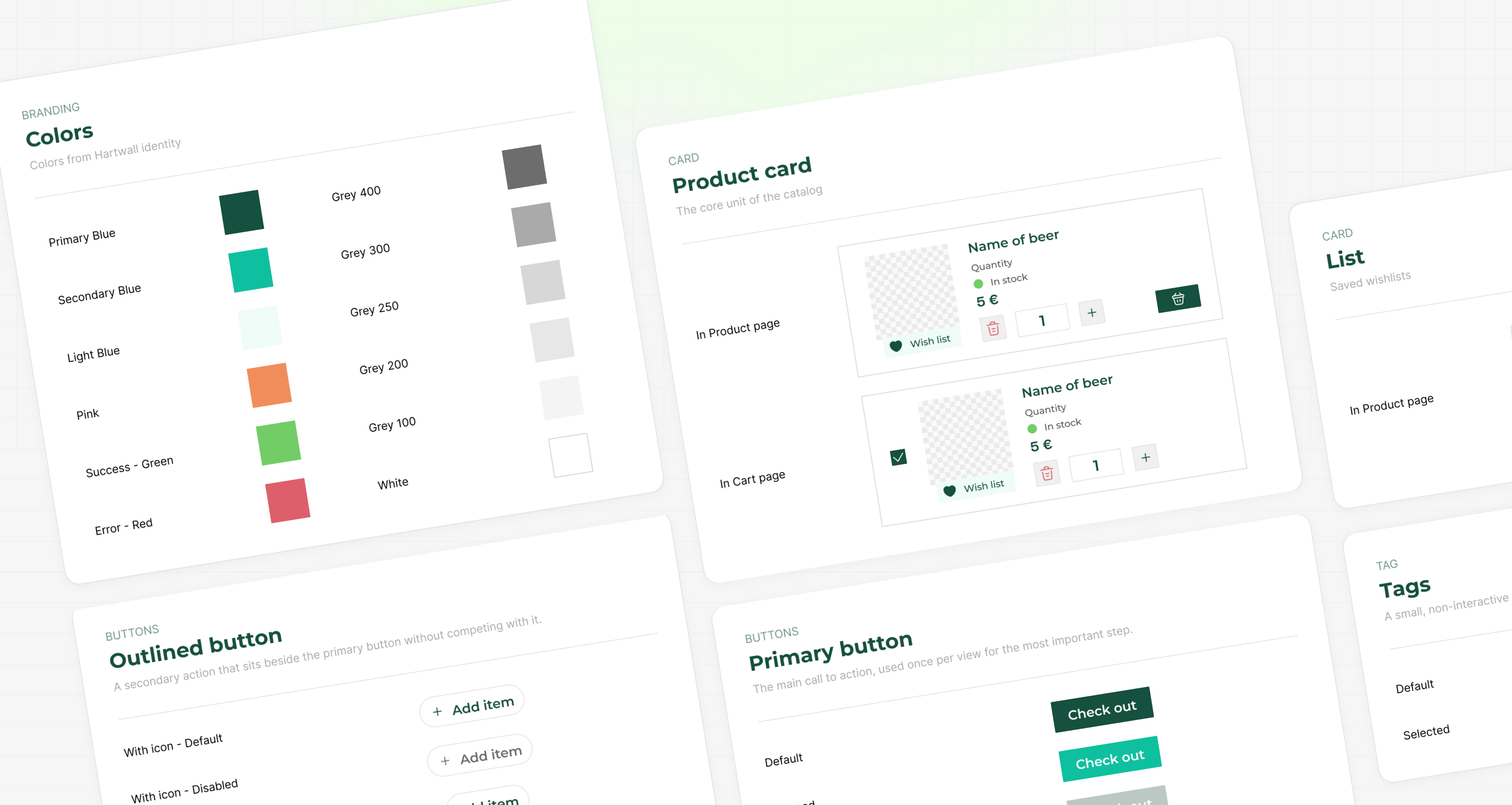
The two products are the same app with different brand identities: identical structure, flows, and components, dressed as Royal Unibrew for Denmark and Hartwall for Finland. Building the design library from the very beginning made this straightforward. With brand values like color, type, and logo defined as tokens, swapping one brand for the other is a matter of changing the theme, not rebuilding screens. One system, two fully branded apps, with no duplicated effort.
Process
User research, to UX wireframing, to UI design, to a validated design system, to usability testing in both markets. The interviews didn’t just validate the concept, they generated it, and the design system let us ship one tested foundation with two brand identities, quietly doing some of the work a sales rep used to do in person.