Renewing Futurice website
- Role
- UX Designer
- Industry
- IT Consulting
- Scope
- UX Design
- Company
- Futurice
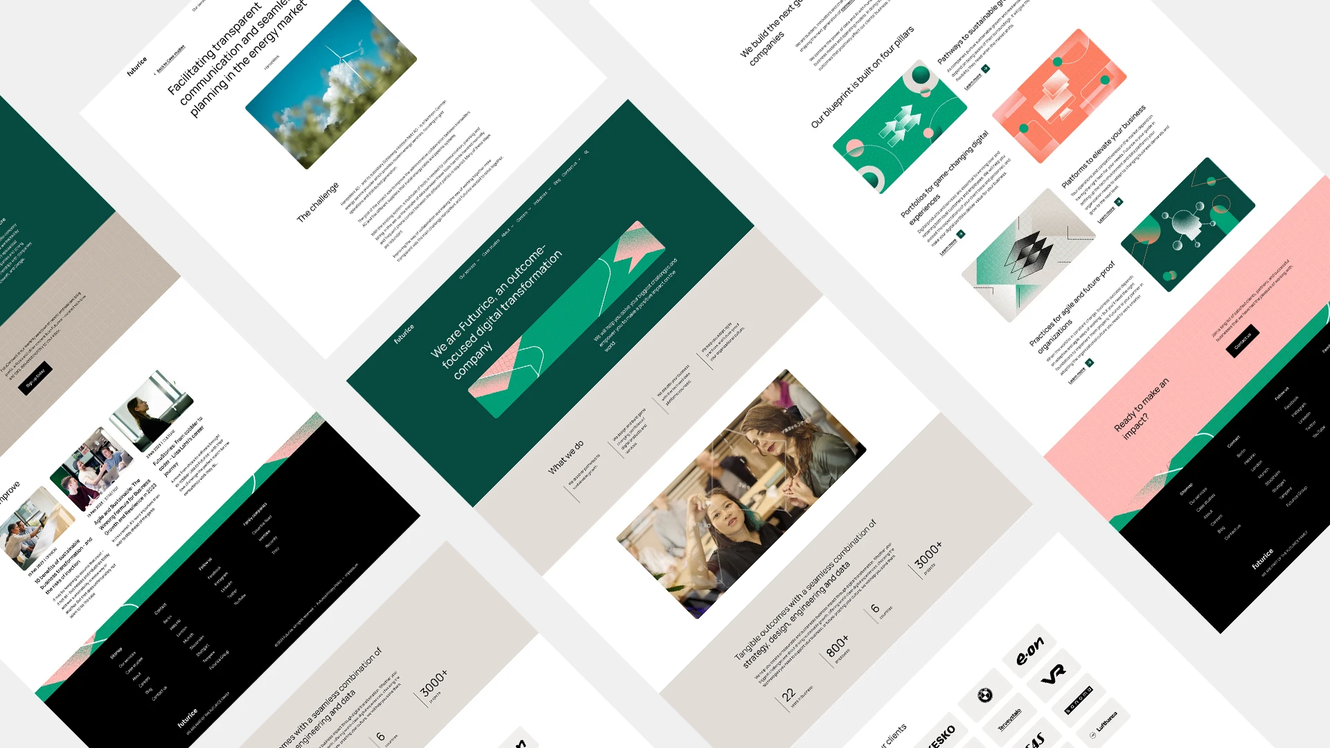
Redesigned an aging corporate website into a consistent, accessible, component-based system, working from a branding agency’s new identity.

Context
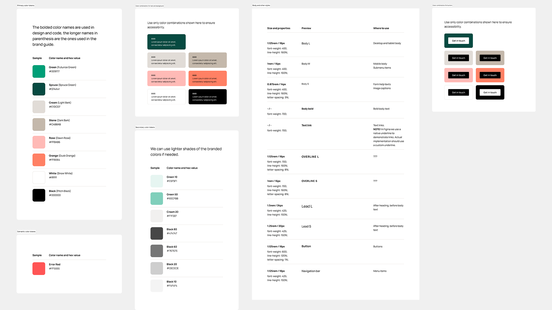
Futurice is a European digital transformation consultancy that helps companies innovate and thrive in the digital age. With this redesign we set out to bring Futurice.com up to a modern design standard with strong accessibility scores, while aligning it with the company’s evolving business strategy. The site had grown old: years of one-off pages meant too many custom layouts, dated visuals, and outdated content. We partnered with a branding agency that delivered a refreshed identity and a sample page or two, but a branding agency is not a UX team, so their work looked good without accounting for how the site needed to work or for accessibility. Our job was to turn that identity into a real, usable, accessible website.
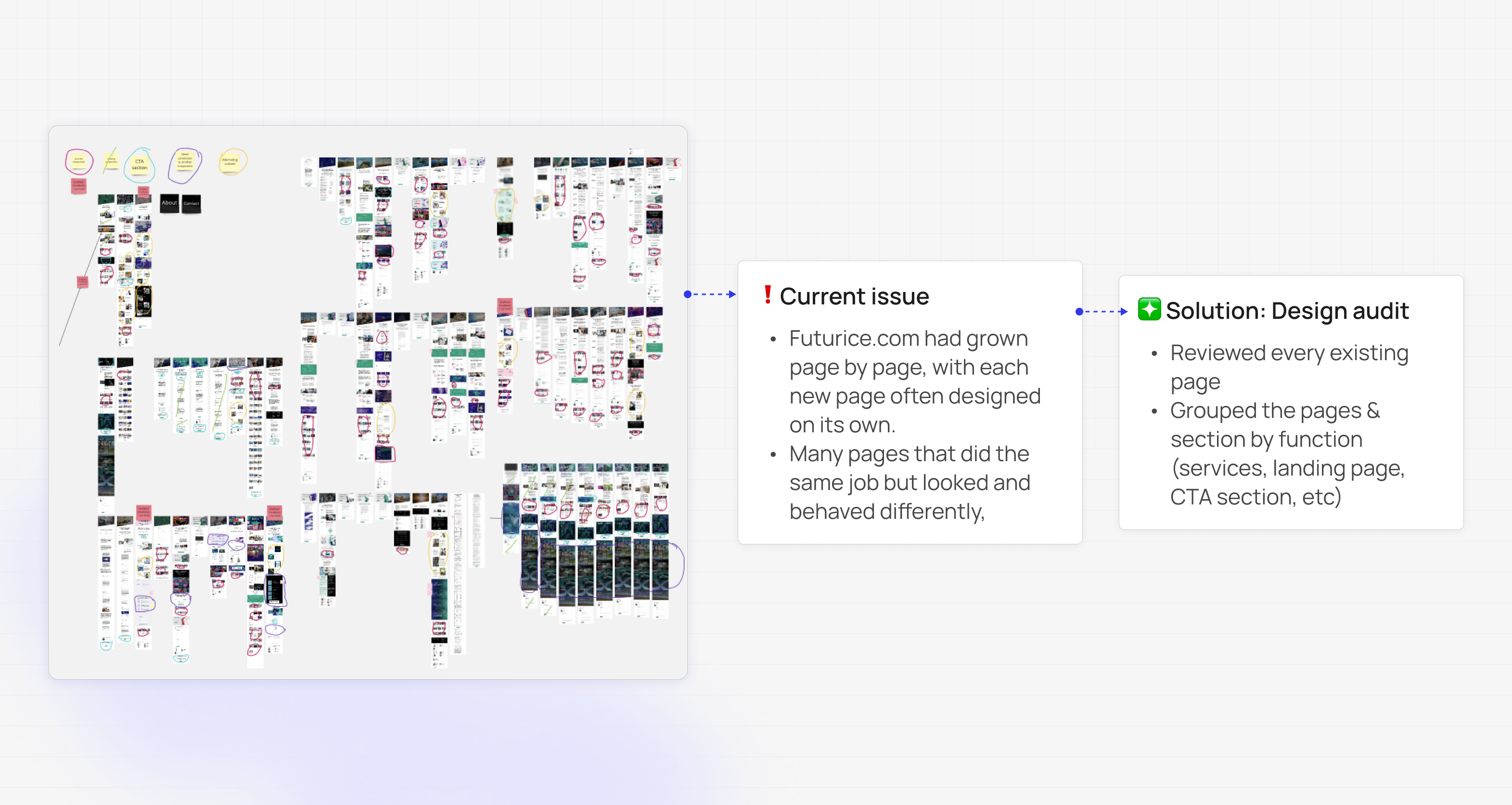
Design audit
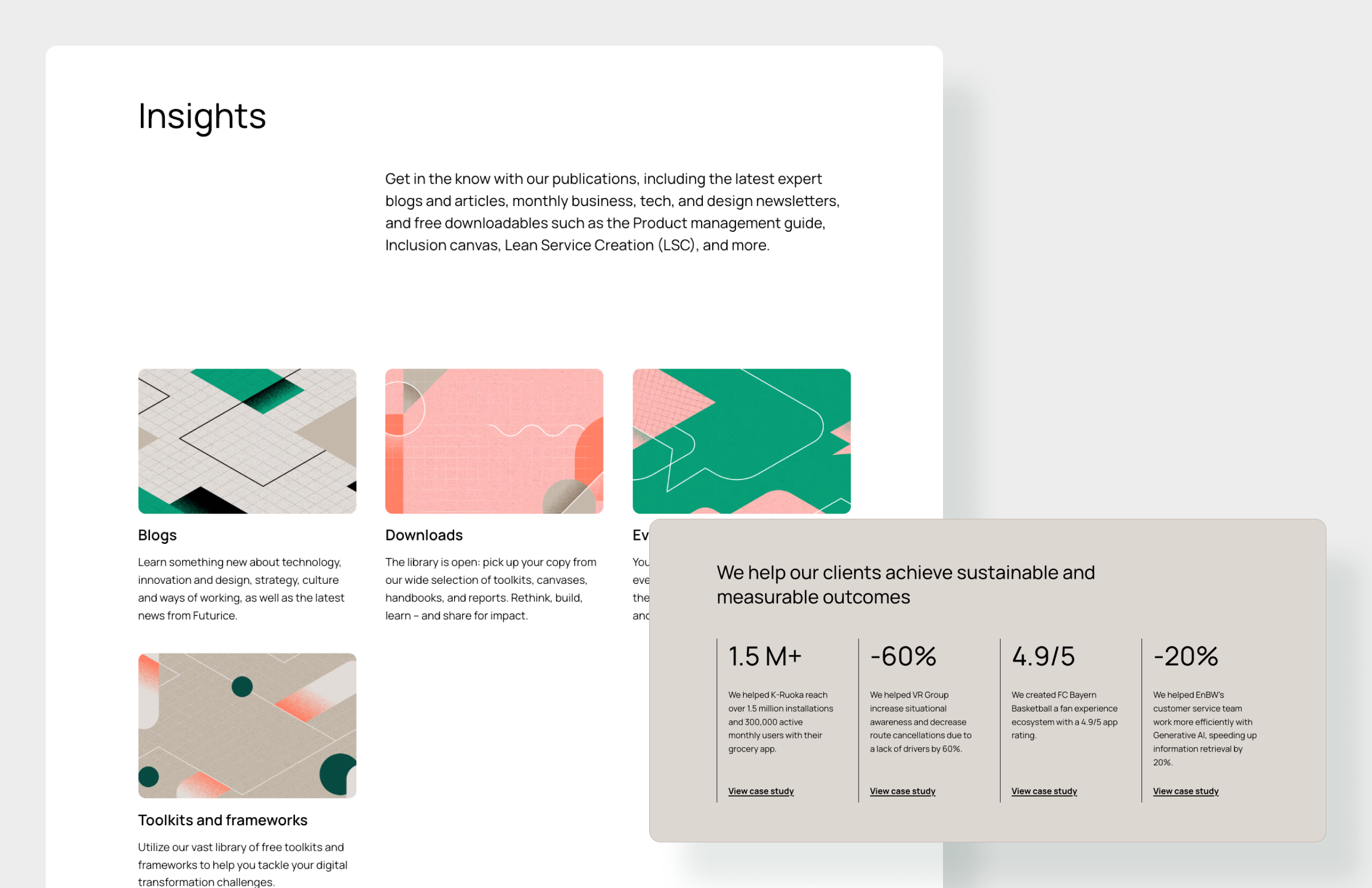
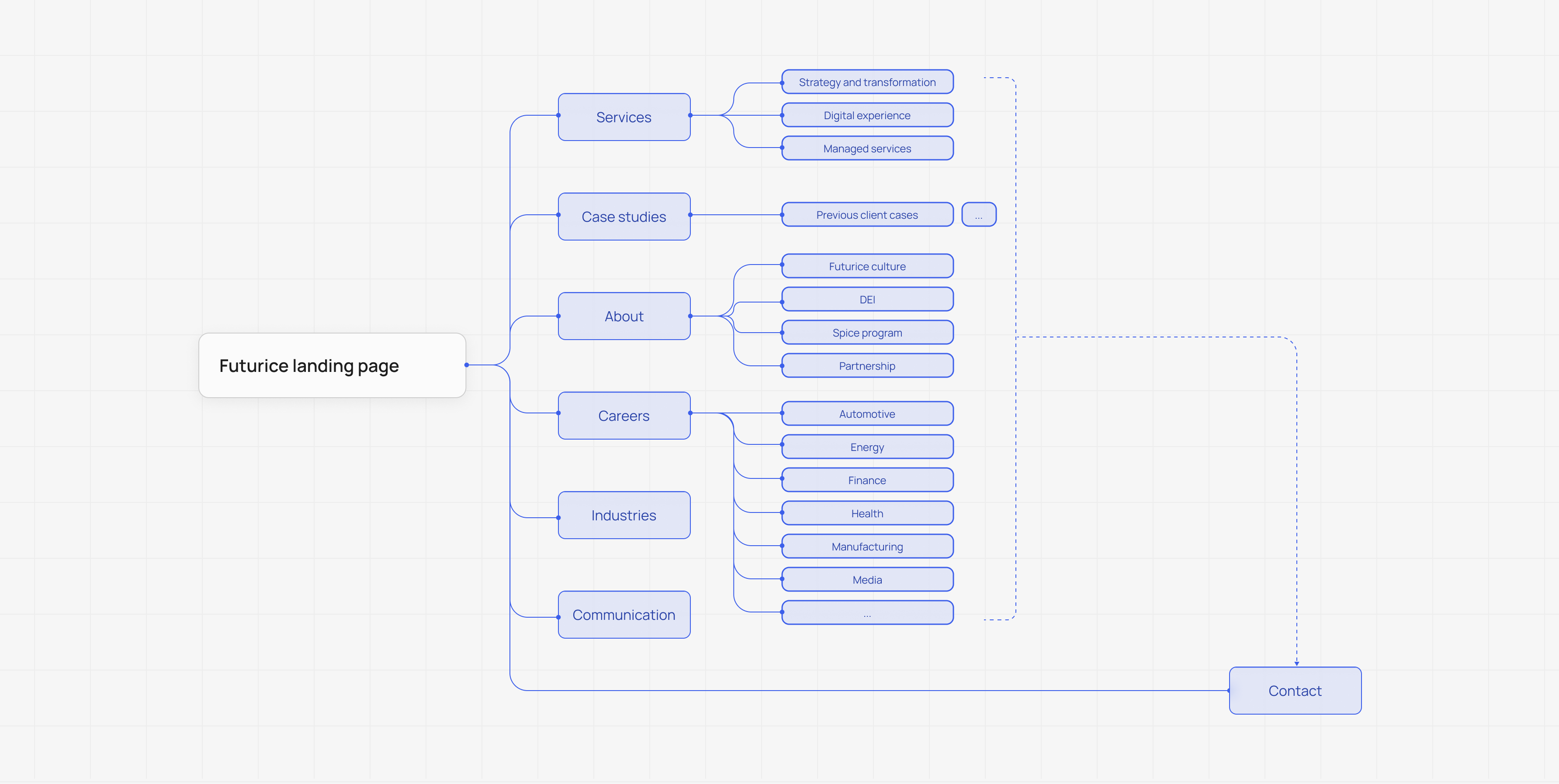
We started by auditing the existing site, grouping pages by the function they served rather than how they happened to look. This surfaced how much was duplicated, inconsistent, or built as a one-off. The audit also shaped the information architecture, helping us define the main groups of content the site should have and how pages should be organized and navigated within them. From there, we designed one common layout for each group that could cover most of its pages, replacing dozens of custom pages with a few reusable templates. The result was a clearer structure and a more consistent site that was easier to maintain and ready for the new brand identity.
Building the frames
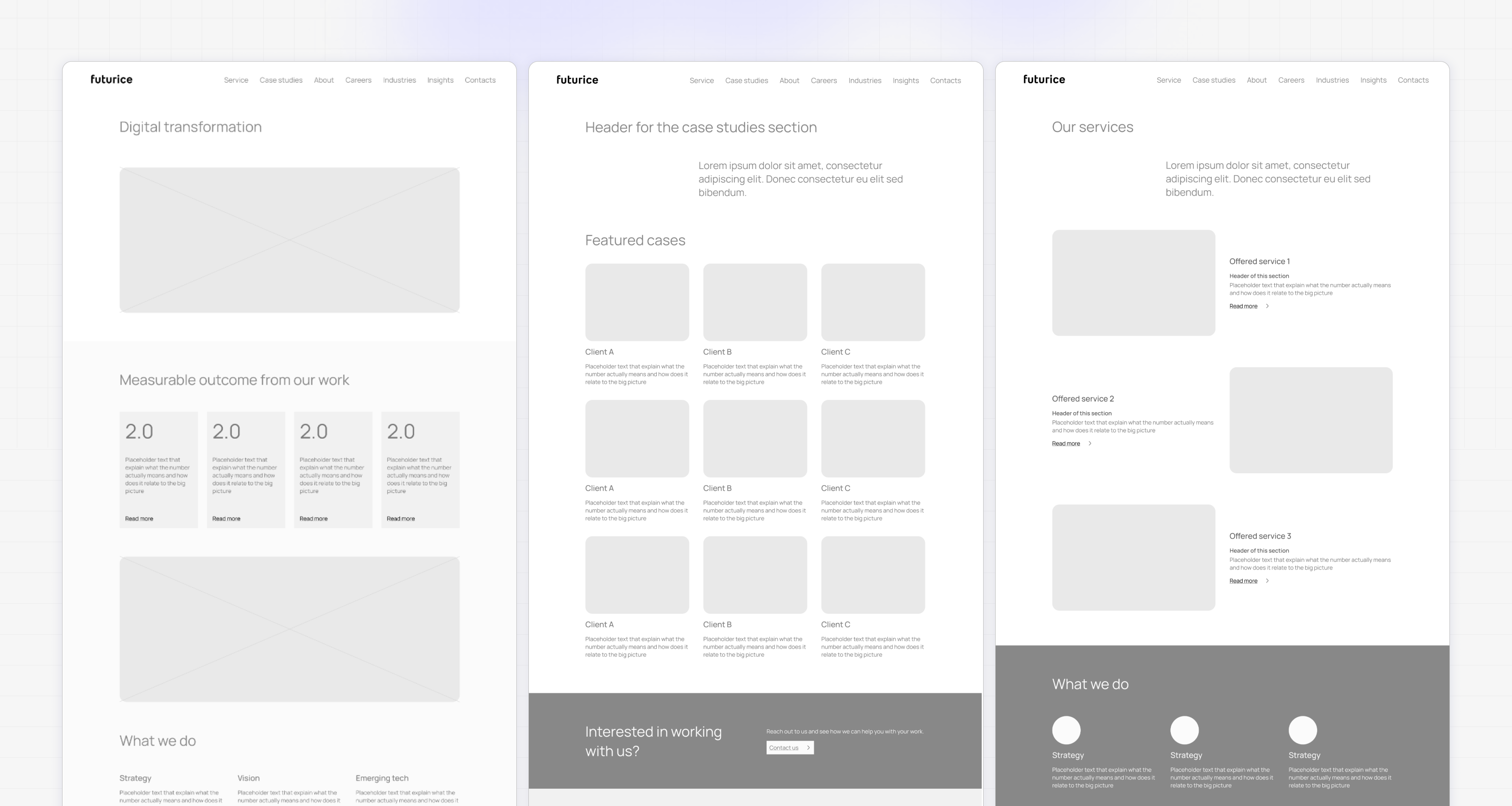
We built the main frames of the different pages for the new website: the base layouts and structure for each content group. We handed these to the branding agency so they could apply the new visual identity on top of a solid, UX-considered foundation, instead of designing screens from scratch that we would then have to fix. This kept the structure sound and accessible while letting the agency focus on the look.
Validate and build
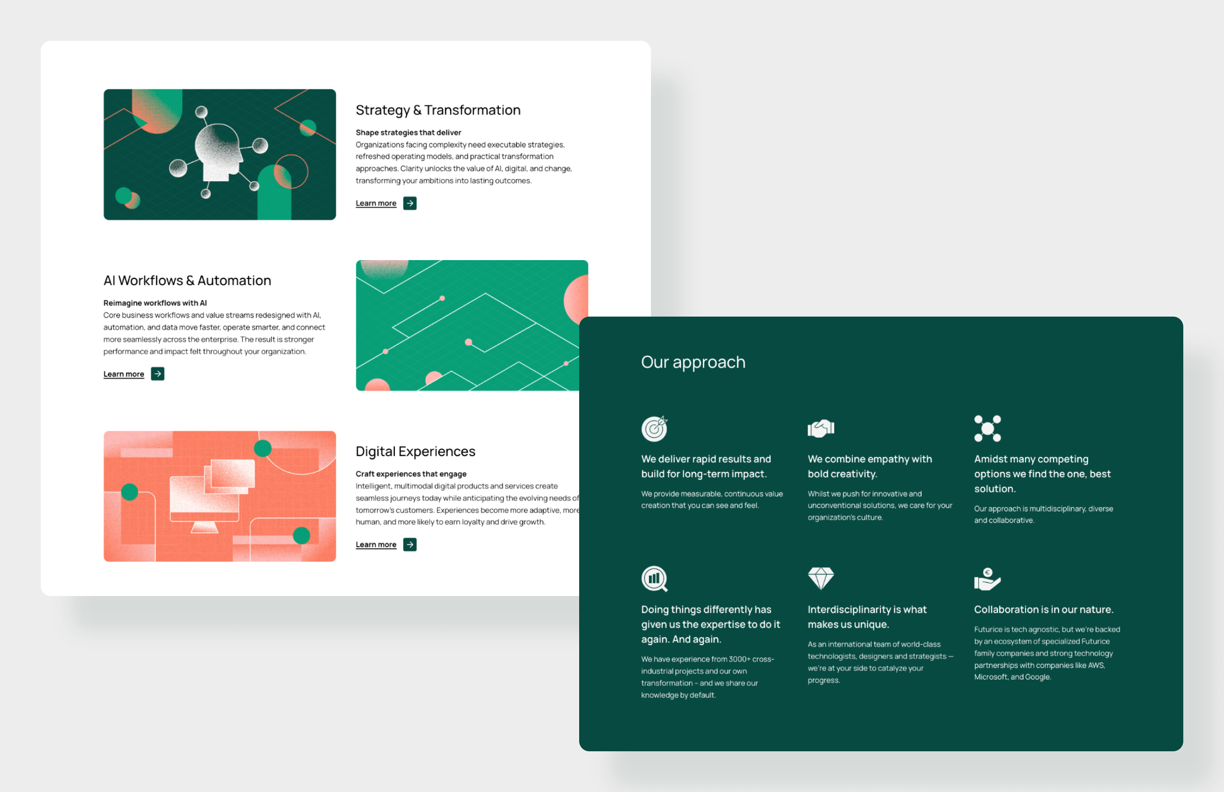
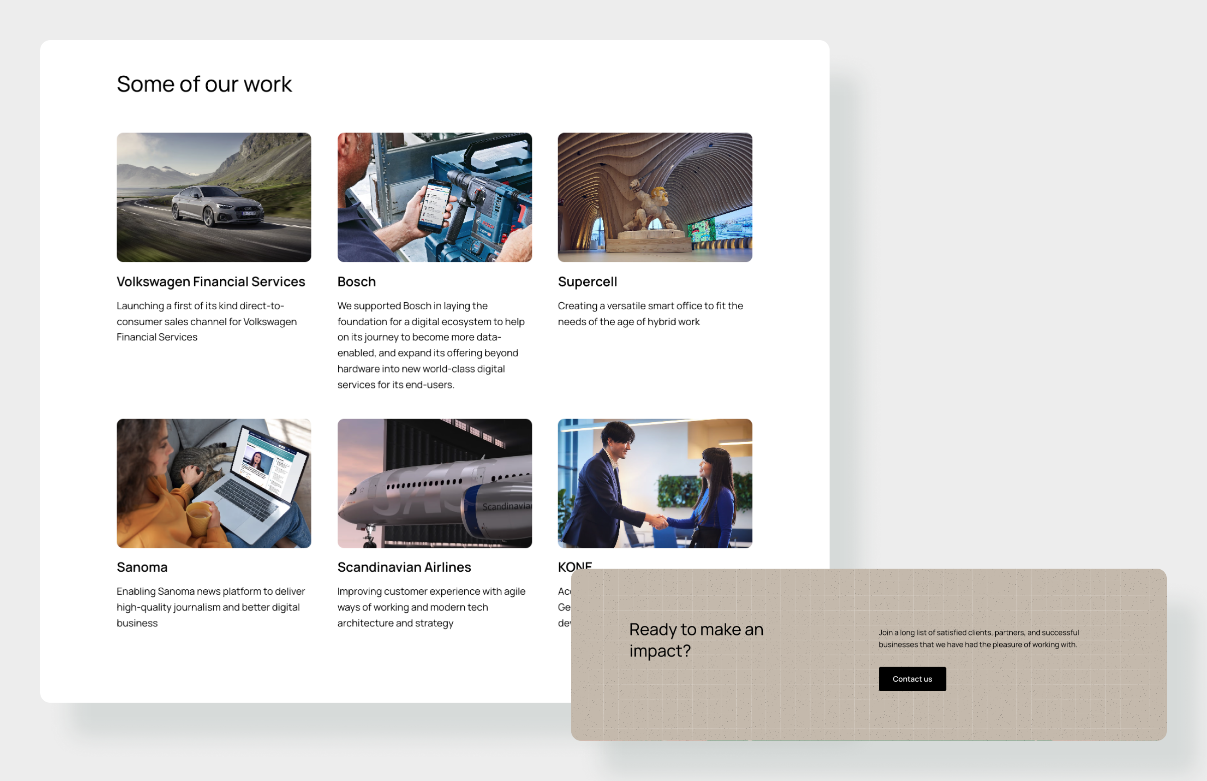
The agency’s designs still needed checking before they could ship, so we validated them to make sure they were both accessible and visually right, adjusting where accessibility had been missed. They only provided one or two designs, so we designed the rest: the remaining page types and the components that weren’t in their files, all consistent with the new identity.
Outcome
The refreshed Futurice.com was built on a coherent design library instead of scattered custom pages: fewer templates doing more work, an accessible experience throughout, and a system the team could keep extending. What’s live today is the result of many people building on top of that foundation over time; we initiated the change and set the direction it grew from.